Canada Post
Redesigning the responsive mobile navigation to create a quicker, simpler, and more intuitive way for visitors to access the tools, services and information they need on Canada Post’s website.
Year
2021 (3 months)
Role
Product Designer
Contribution
UX, Visual/UI, Prototype
PROBLEM
Canada Post is the national postal service of Canada, serving over 17.8 million residential and business customers. Despite its scale, the website's mobile navigation made it surprisingly difficult for everyday users to find basic information.
The information architecture had grown organically over years. Layers of nested menus, inconsistent labelling, and a structure that made sense internally but didn't reflect how users actually thought about the service. Users who couldn't find what they needed on the site were calling customer support instead. Every failed navigation moment had a direct cost.
Goal
Ensure the Canada Post website navigation enables visitors to find and discover the information they need in order to reach their goals.
CRITICAL RESEARCH INSIGHTS
To understand where the navigation was failing we looked at insights presented by the research team through usability tests and card sorting.
Not all users arrive at the homepage. Google remains a major entry point for visitors to get to the website.
Users want to be “in and out” of the website. Activities requiring more effort or clicks are deemed difficult and tedious.
CPC is not associated with online shopping. Some participants had or have no awareness that Canada Post has an online store.
Several navigation labels were seen as confusing, repetitive, or holding multiple or conflicting meanings.


When having difficulty locating information, the majority of the users attempt to use search, followed by contacting support and lastly default to looking at tools.
Users pull from what they already know. Users take advantage of previous knowledge and experience to help them find what they need.


CONSTRAINTS
One of the largest constraints of the project was the inability to change the multilevel information architecture or the navigation labels — both were out of scope. The focus was entirely on front-end changes to improve the navigational experience.
CURRENT STATE AUDIT
We identified three areas for improvement in the existing navigation:
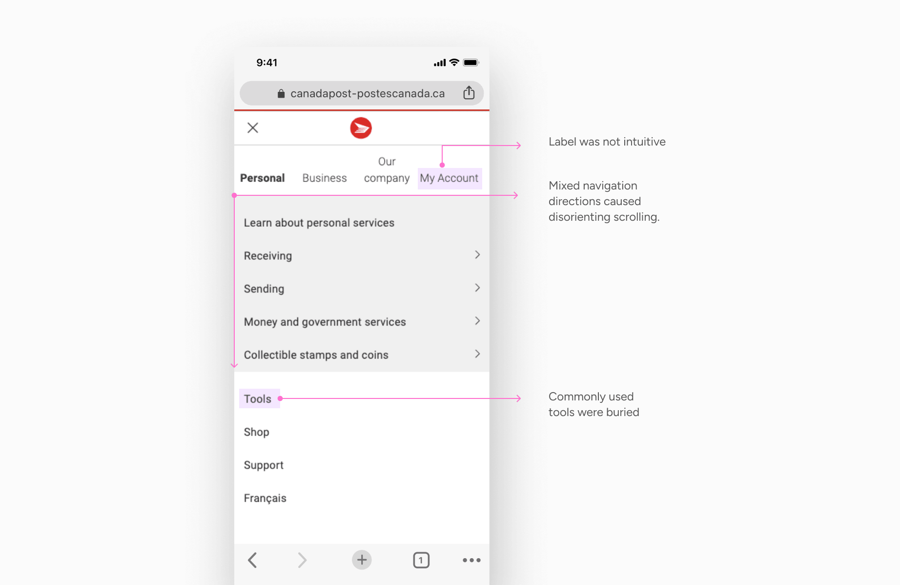
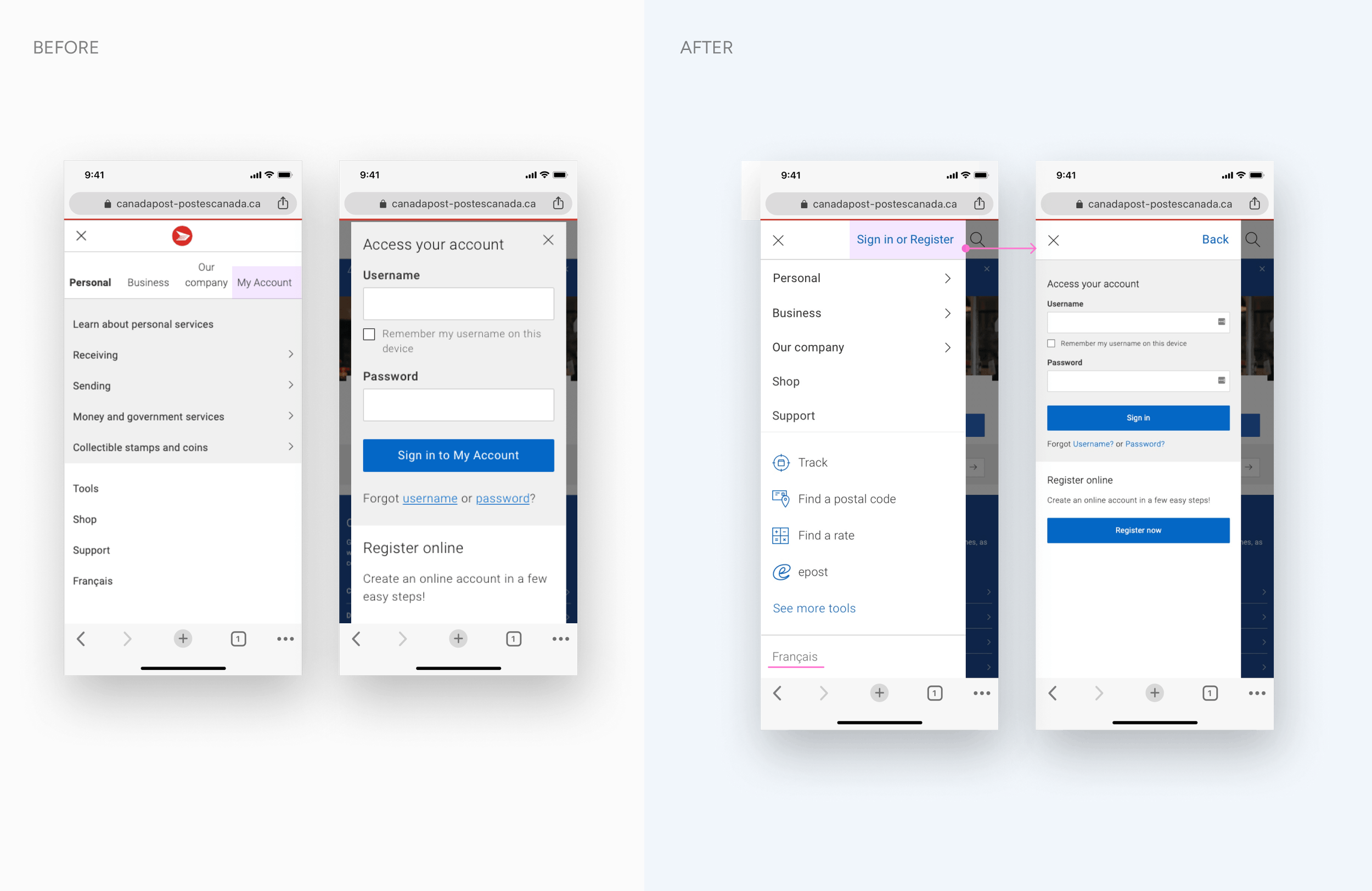
Clearer path to sign in
The "My Account" label was not intuitive, and users struggled to find it quickly.
Improve wayfinding
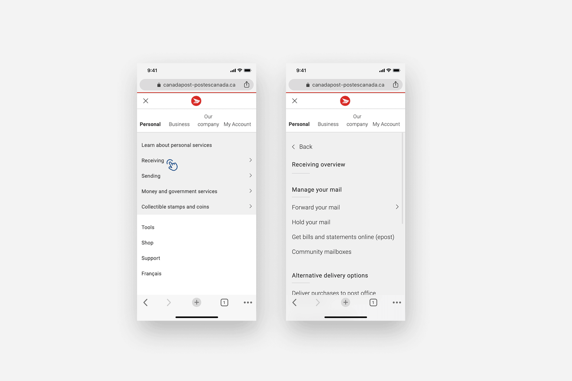
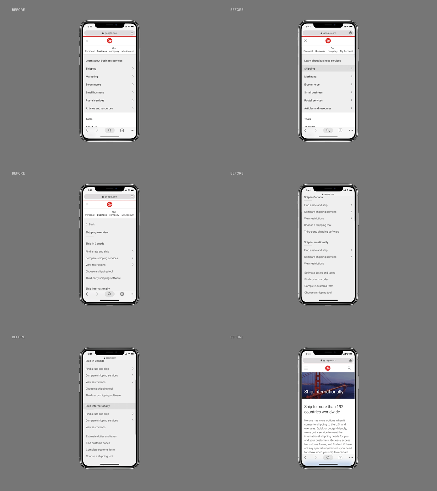
Level 1 labels were placed horizontally while sub-levels were placed vertically, creating a long, disorienting scroll as users moved deeper into the navigation.
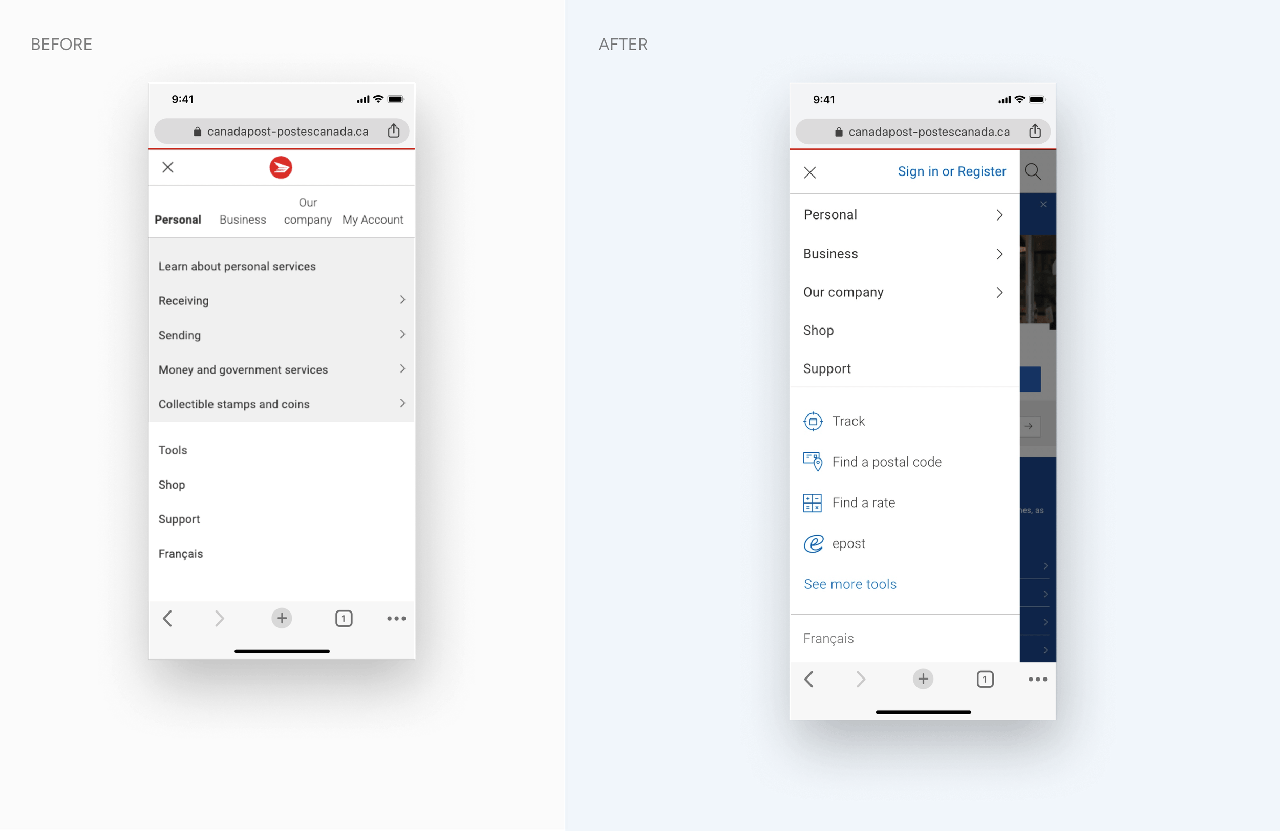
Quicker access to tools
Commonly used tools were buried, requiring too many steps to reach.
APPROACH
Breadcrumb vs. Tiered Approach
The main challenge was helping users move through a four-level navigation without changing any category names or order. With so many levels, finding a mobile navigation pattern that worked was difficult.
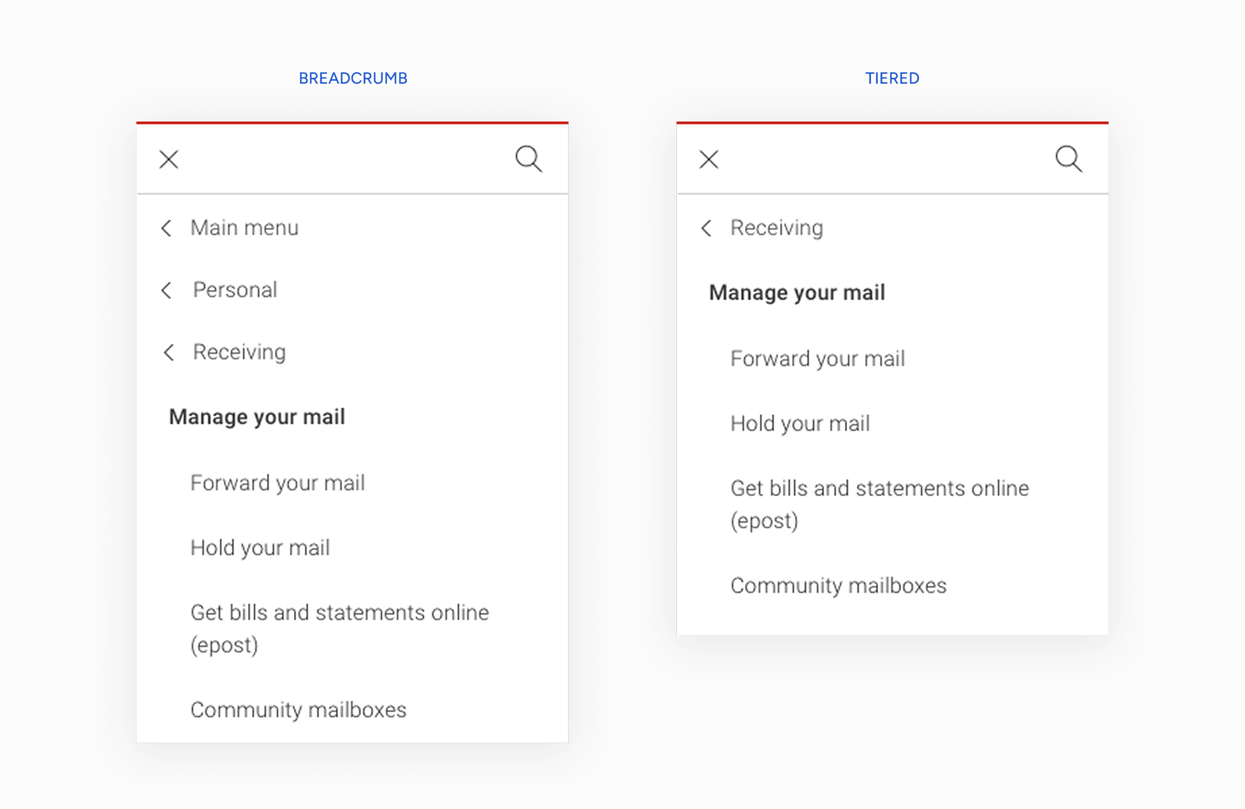
We explored many options and narrowed them down to two approaches: Breadcrumb and Tiered. Each solved part of the problem but introduced tradeoffs. Breadcrumbs aided orientation but added visual complexity, while the tiered approach was cleaner but limited backward navigation.
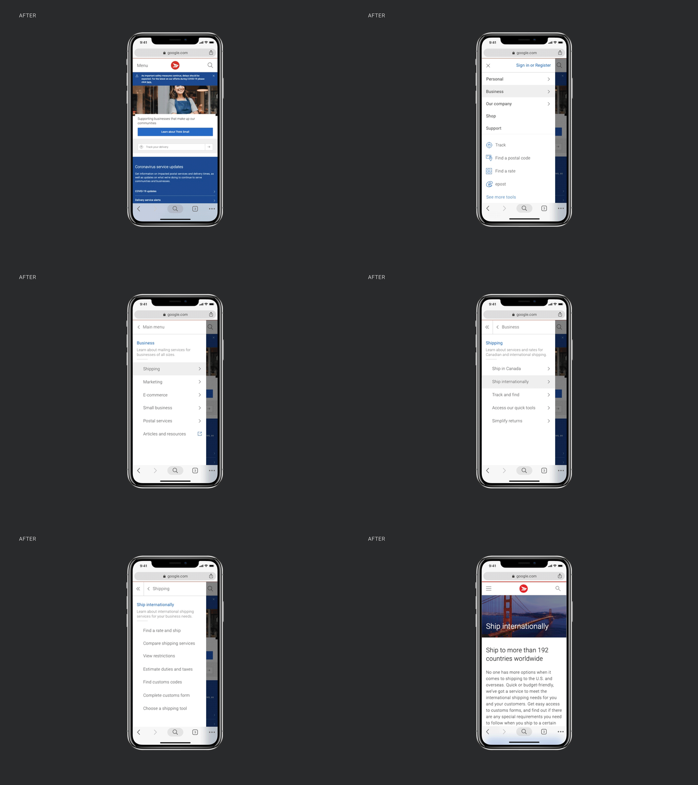
In the end, we decided to use a combination of both.
Improved wayfinding
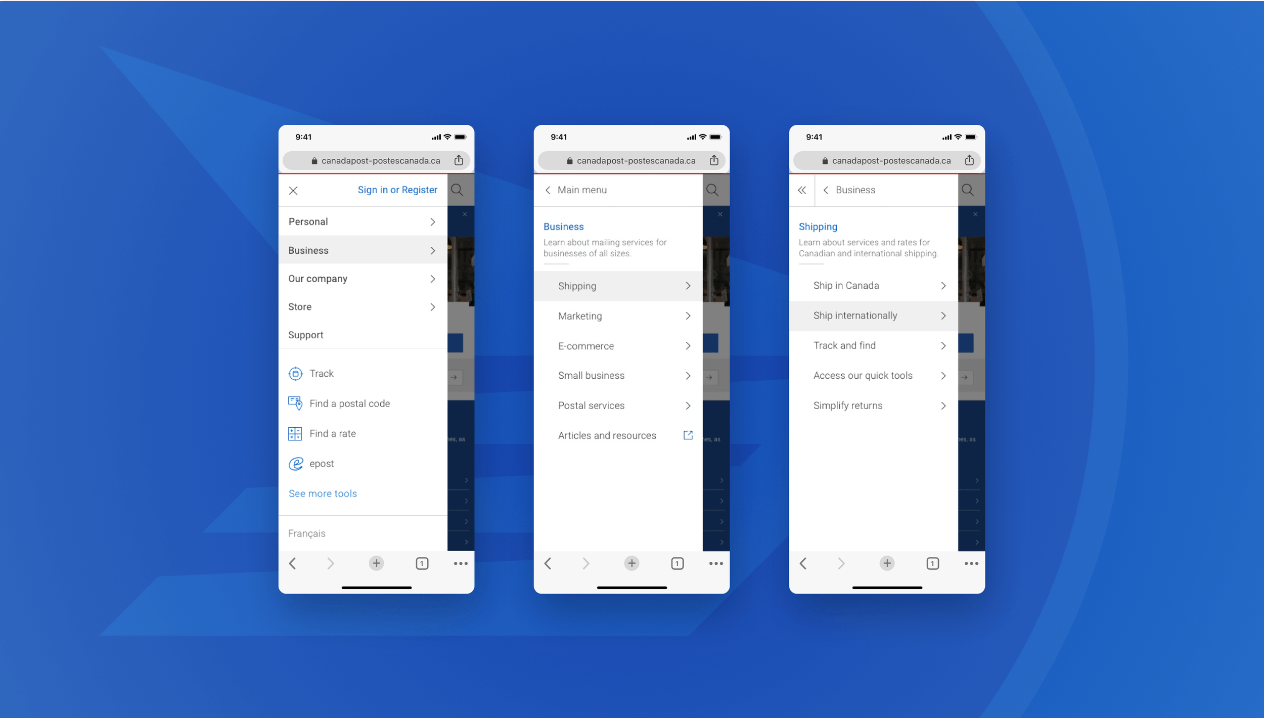
We opted for a flyout menu to give users the freedom to access search or exit the navigation at any point without losing their place. We also replaced the hamburger icon with a "Menu" label for clarity, and placed all navigation items vertically with Store and Support surfaced at Level 1 for higher visibility. The tiered version allowed users to move back one category at a time, reducing disorientation in a deep navigation structure.
Clearer Path to Sign In
We placed the Sign In button at the top right of the open menu, so it’s always visible, always accessible. We updated the language from ‘My Account’ to ‘Sign in or register’ to better reflect user expectation. We also repositioned the language toggle below to better reflect the hierarchy of user needs.
Quicker Access to Tools
Based on user insights we also explored quicker ways to access tools. Ultimately landing on surfacing the most frequently visited tools.
Results
34%
Increase in engagement with tools (Track and Find a Rate) since deploying the new navigation.Future iterations
Remove duplicated links and pages in the navigation architecture, and revisit labellingStrengthen overview page templates to remove Level 4 pages, redirecting traffic to overview pages and decreasing bounce rates from deep navigation levels