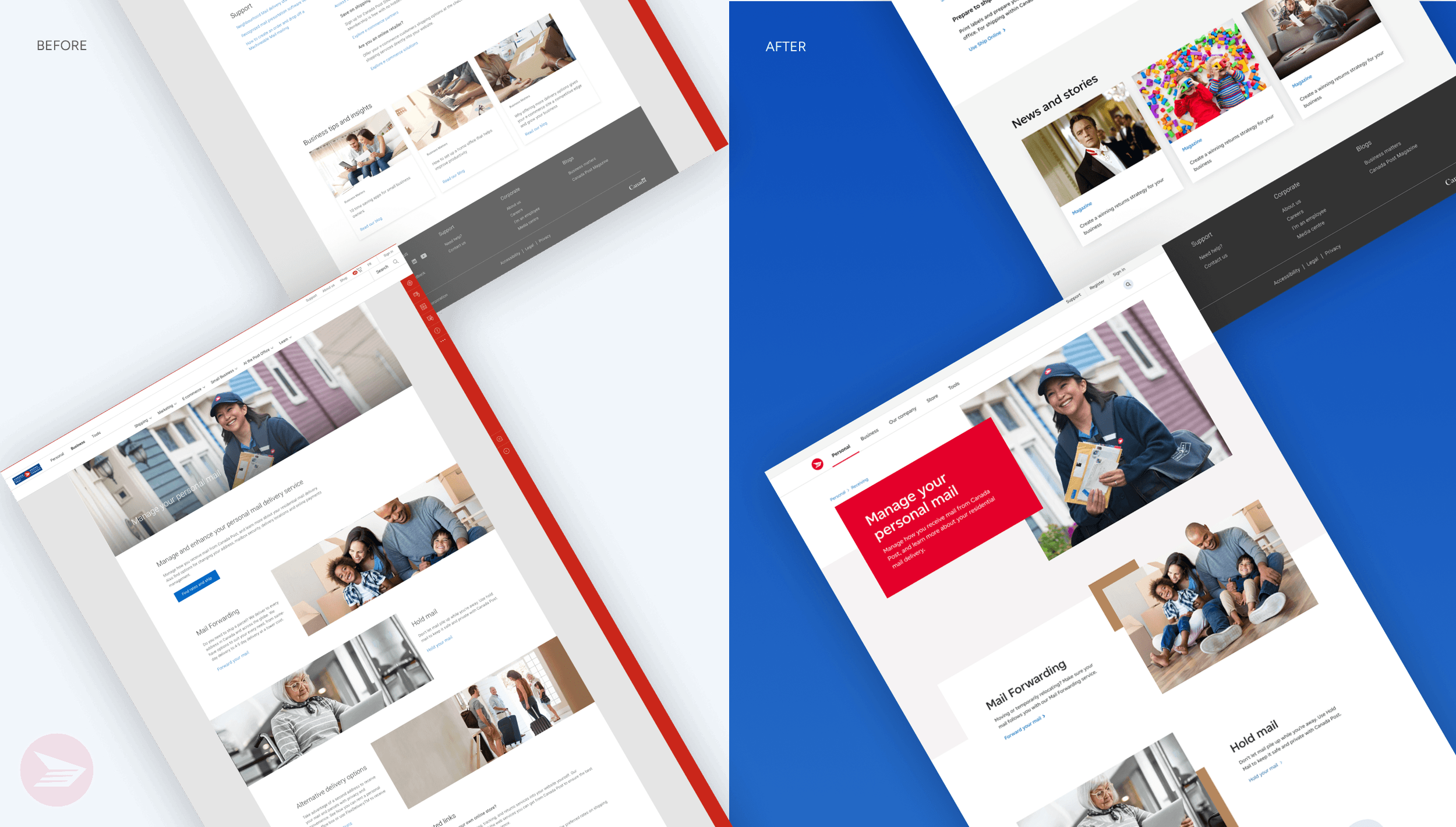
Canada Post
Rebranding Canada Post's responsive website to create a more user-friendly and accessible experience for all Canadians.
Year
2021
Role
Product Designer
Contribution
UX, Visual/UI — selected alongside a team of 3 designers to incorporate new brand guidelines into Canada Post's digital ecosystem
PROBLEM
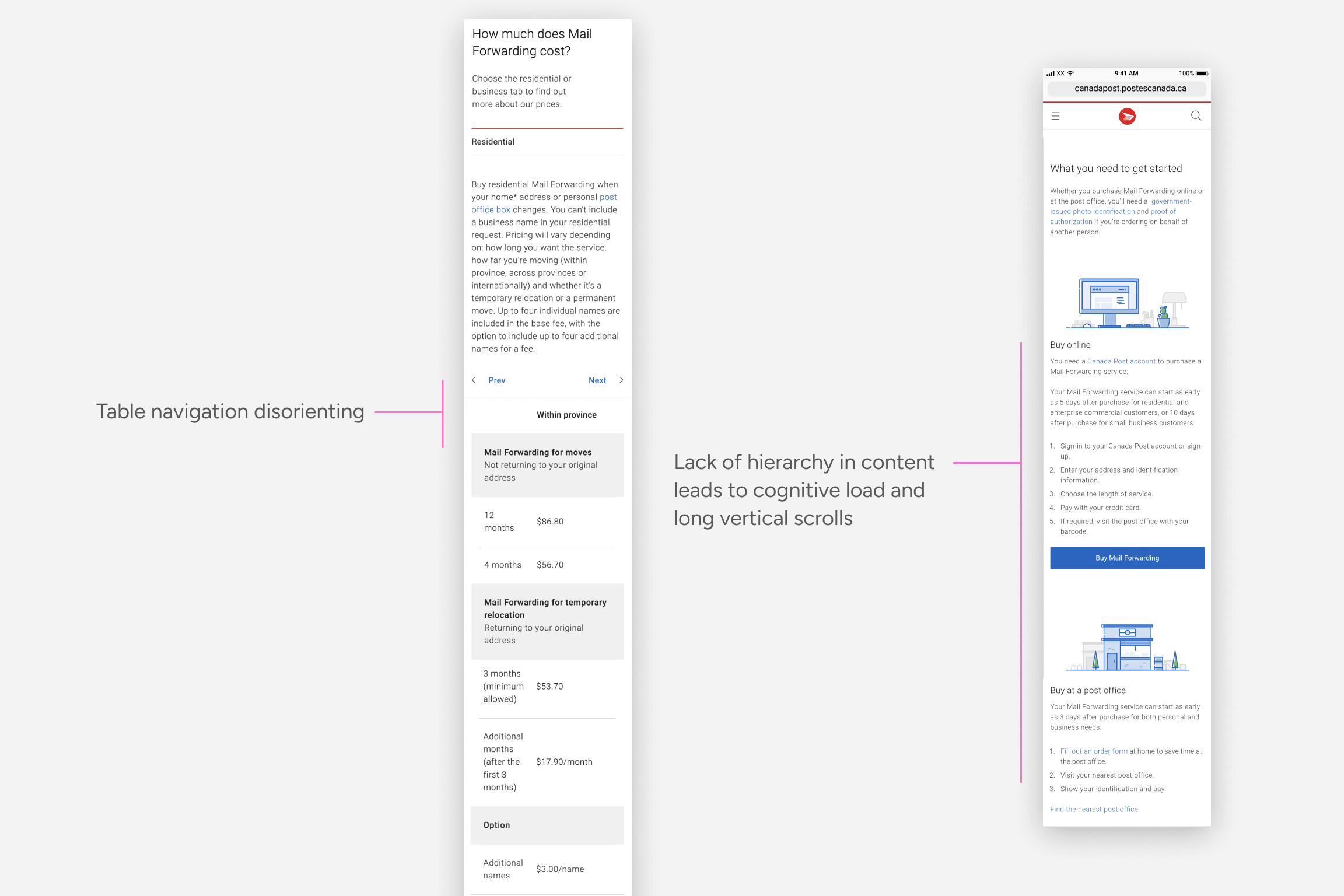
Canada Post's website was built on a complex CMS, and poor responsive patterns had persisted across it for years. When a third-party agency delivered new brand colours, typography, and visual language, the challenge wasn't simply applying them, it was using the rebrand as an opportunity to identify gaps in existing components and meaningfully improve the experience for users, not just its appearance.
Goal
Deliver a seamless, accessible experience for consumers and businesses by making information easier and faster to find, improving accuracy, efficiency, and overall satisfaction for all Canadians.
APPROACH
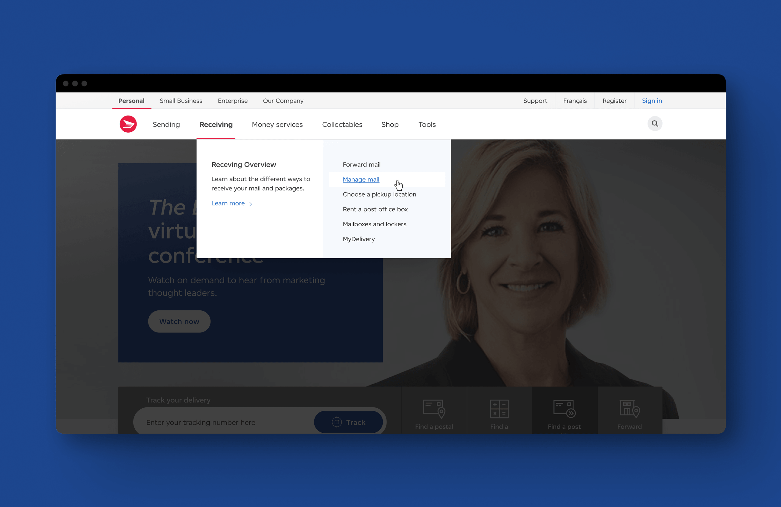
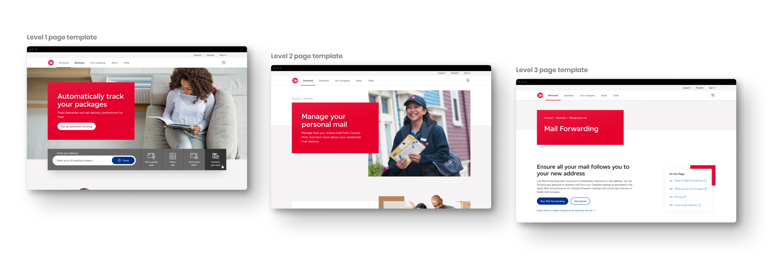
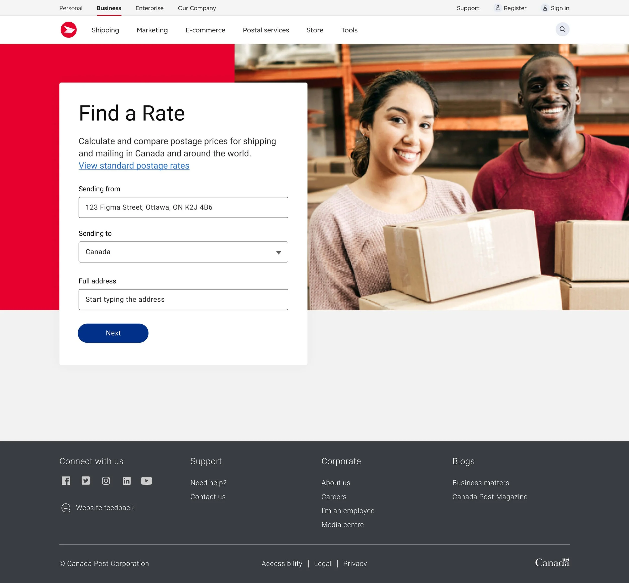
I was responsible for the redesign of the global navigation, page templates, tools, and icons. Working in close collaboration with researchers and the accessibility team, my approach followed three stages: a current state audit to identify gaps in existing components, concept testing with personal and business customers on desktop and mobile, and iterating designs based on user insights.
The process included weekly design sprints, wireframing, prototyping, usability test observation, and continuous iteration.
CONCEPT TESTING INSIGHTS
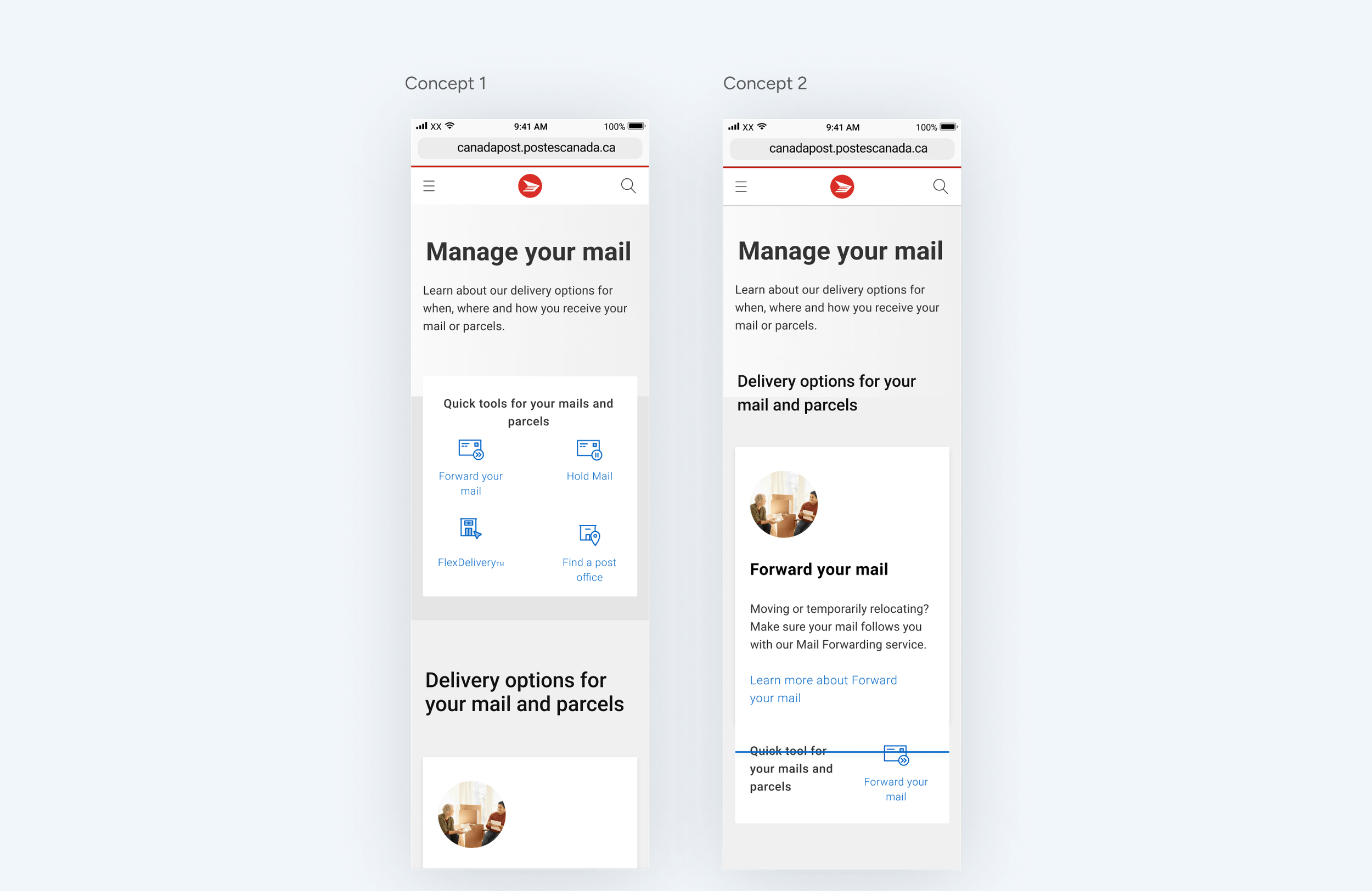
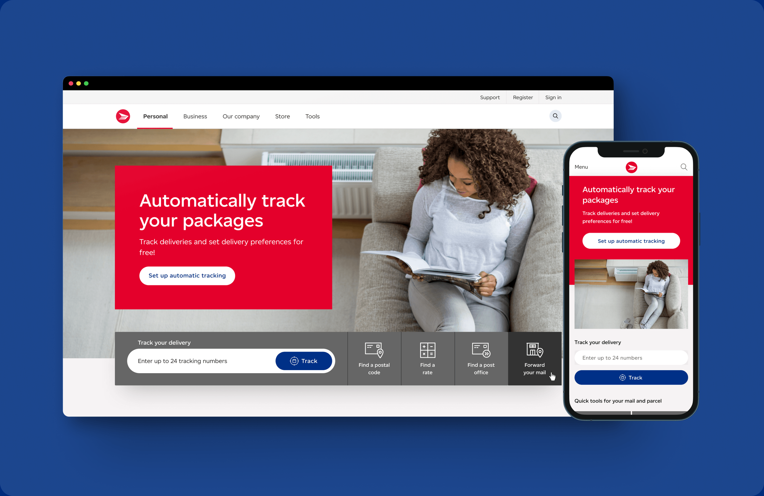
Quick tools
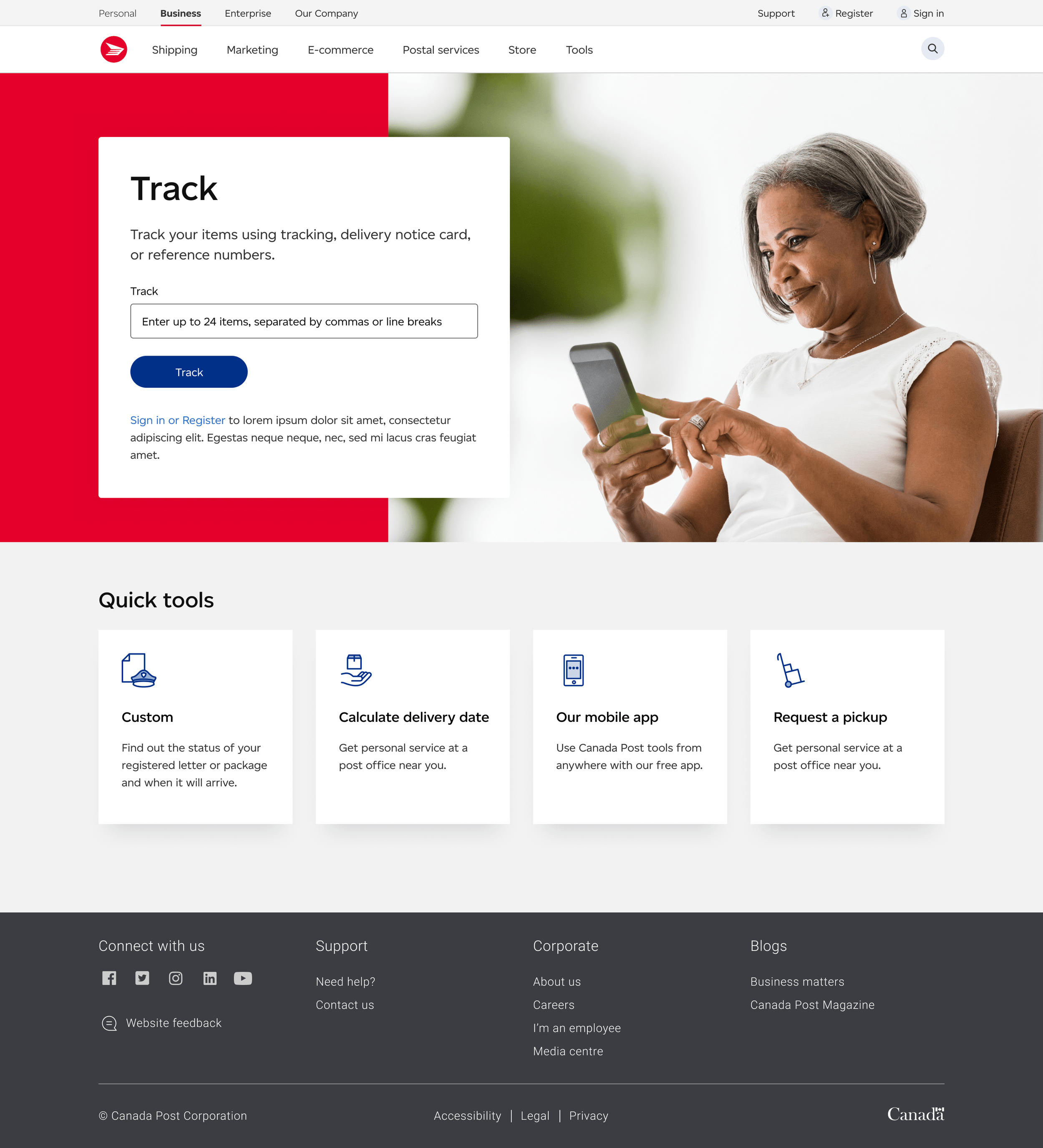
On mobile, most participants preferred the concepts over the current version but were divided on which concept they preferred. The consistent signal was that users wanted quick access to tools but needed context alongside them. Icon-only patterns weren't enough.
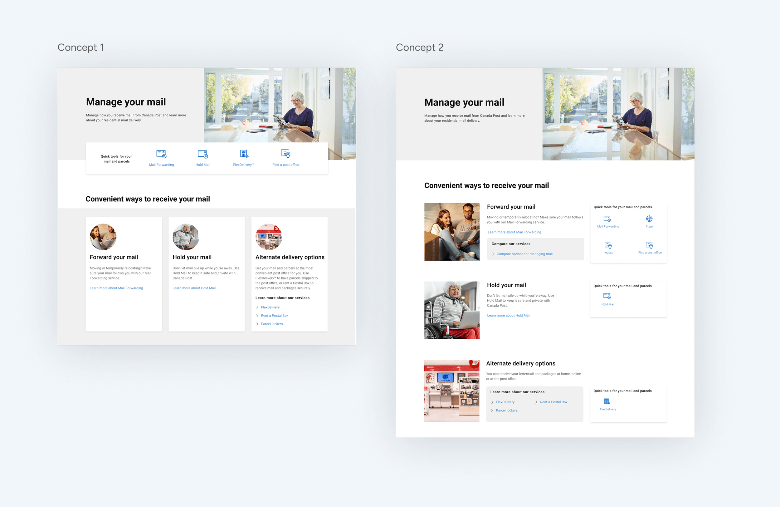
On desktop, Concept 2 was the clear favourite, with users responding positively to shorter page lengths and the surfaced quick tools.
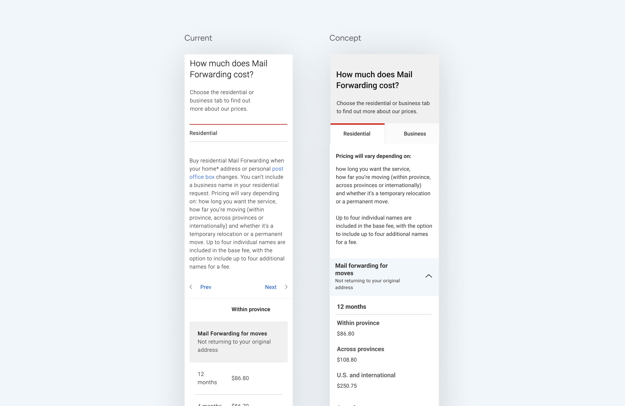
Comparison tables
On mobile, 83% of participants preferred the concept over the current version. A critical finding emerged: the current table component was causing CTA blindness — users couldn't see the previous and next CTAs, which was a severe blocker in helping them find the right product price. It led us to rethink how we structured information hierarchy within table components, ensuring the most critical actions were always visible without requiring users to scroll or hunt.
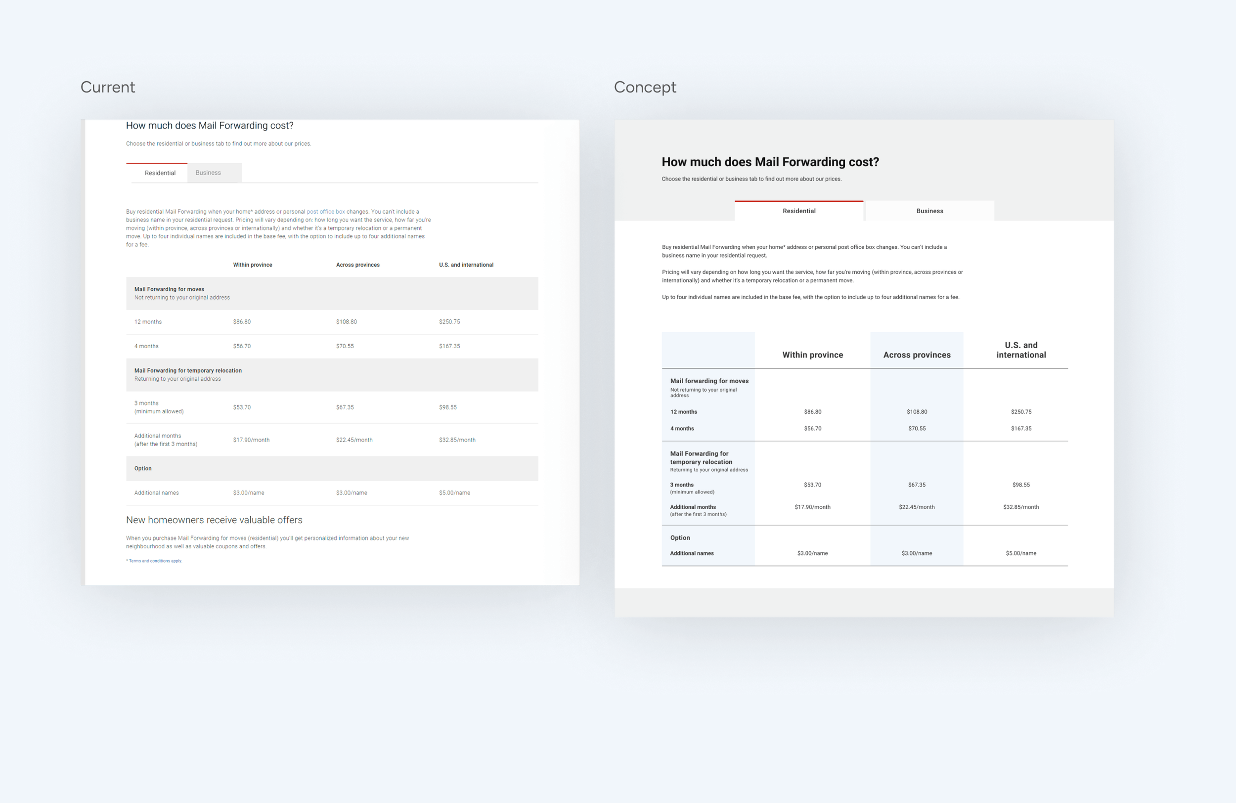
On desktop, 67% preferred the concept, responding positively to the improved font, alternating column colours, and clearer tabs.
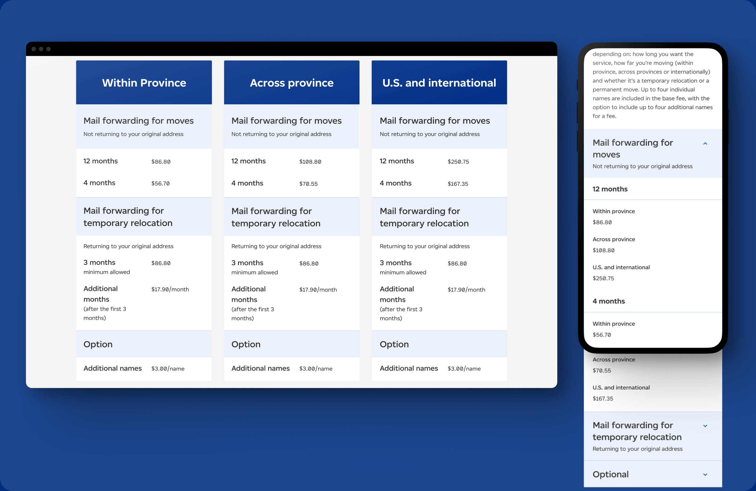
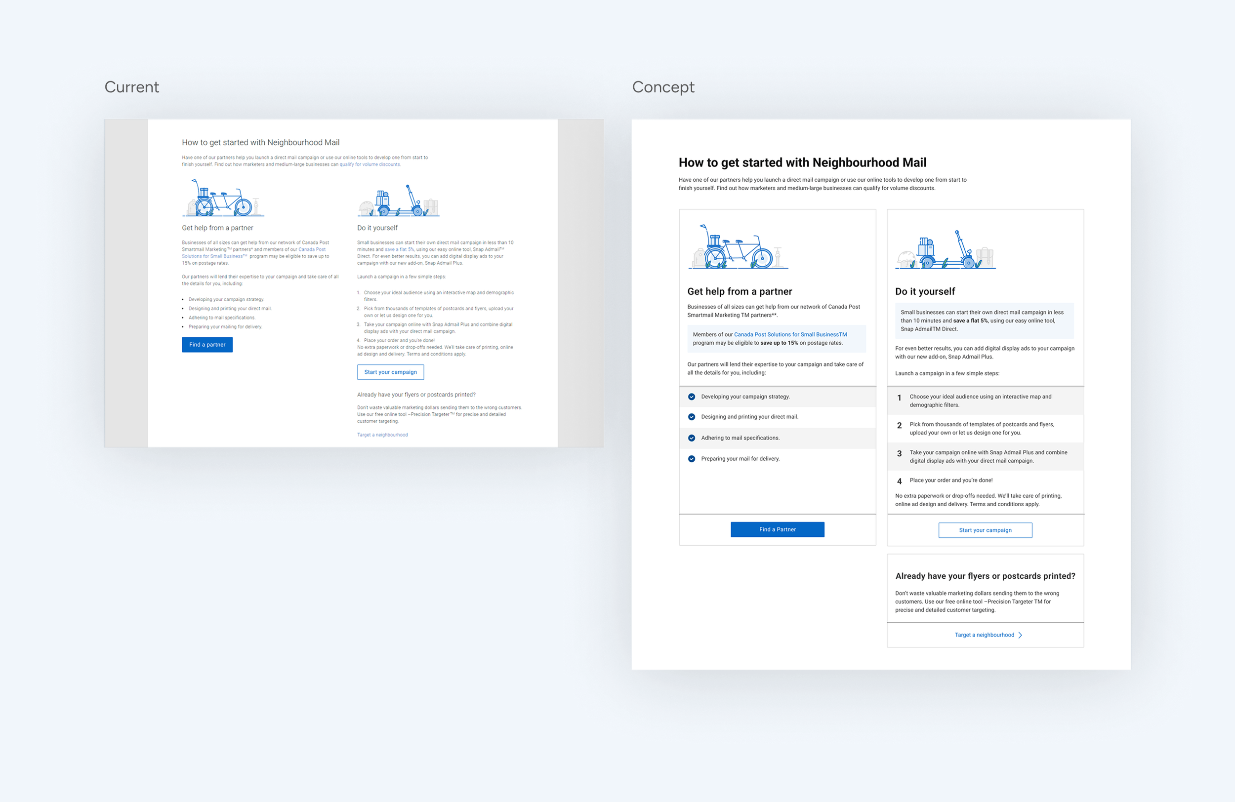
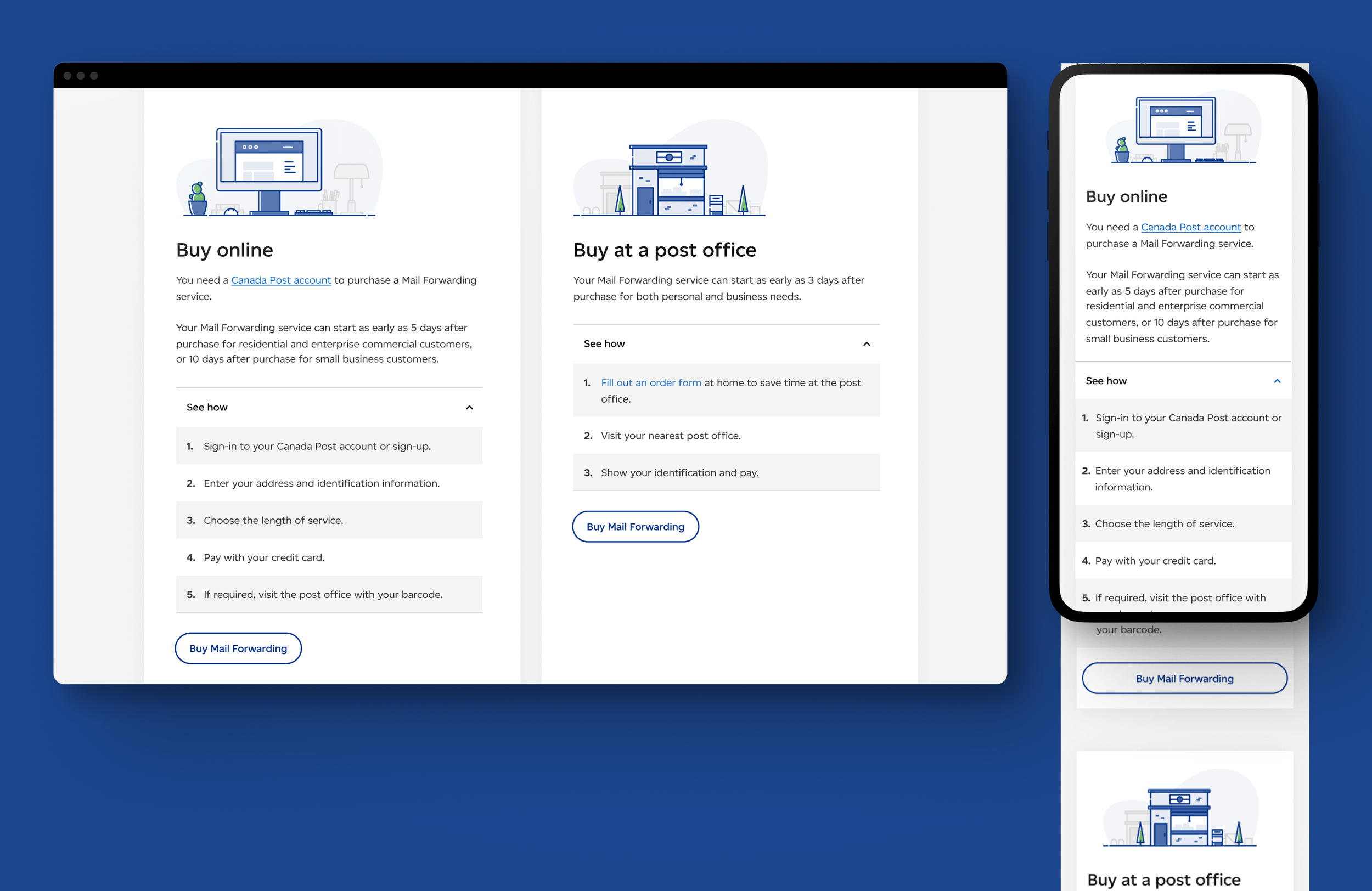
List component
On mobile, 67% of participants preferred the concept, citing clearer font and layout.
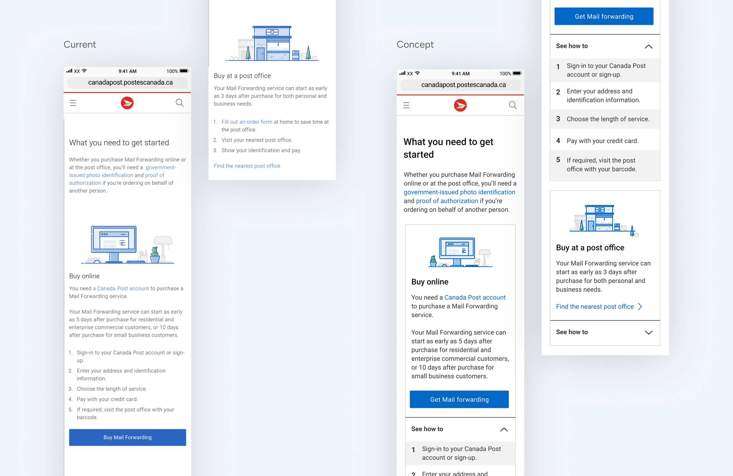
On desktop, the preference was unanimous — 100% of participants found the concept's font and format easier to read and skim.
Results
The rebranded component library became the foundation for Canada Post's ongoing design system — giving future teams a scalable, accessible set of patterns to build on.
We also saw the following results from customers who viewed the redesigned pages
30%
improvement in overall site accessibility19.7%
increase in our System Usability Score from 71 to 85 as tested on our redesigned pages on desktop20
points rise in key task success rates